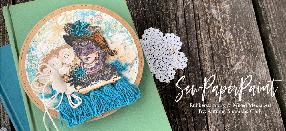
Hello! Today I am sharing a couple of simple, but elegant cards I made. This stamp is my mom's and I just couldn't put it away without getting some ink on it first! I was thinking about a post of
Alison Bomber's where she said she rarely stamps in black. My mind was blown! I ALWAYS stamp in black. I don't know why, but I do! But I ADORE Alison's work and want to learn as much as I can from her. So I decided to see how two almost identical card designs would differ in both black and sepia inks. I used distress inks to create a simple colored background, then stamped onto them. The top card has distressed edges, the bottom card has Distress Crayon rubbed along the edge. A fun experiment, and I am happy with both results. But I want to know your opinion. Is the black too harsh or the sepia too subtle? Do tell!
Don't forget to share your Floral Frenzy themed project with us at
Stamps & Stencils this month. You have until July 6 to join the fun.
I'm sharing my cards with:


I love them both! (and thanks for the lovely comment on my blog btw. ;)
ReplyDeleteAs I am more the graphical type of artist, I love that the stamping in black creates more depth and contrast and therefore "motion" for the eye as it draws the eye towards the focal points (=the black lines images).
But stamping in brown (or any colour that matches the colour scheme of the "surrounding" on your project) is always a good thing to do if you want to create a more subtle effect without focal points. It's more like "weaving" a carpet with sublte texture and making the stamped images less prominent so they are kind of "woven" into the background.
So really it depends on what you are aiming for. Both ways can look beautiful.
Claudia xxx
Both colourways work equally well Autumn so the contrast between the two makes it difficult to choose a favourite. The black inking does give a very striking finish, whereas the sepia has a much softer feel.
ReplyDeleteLike you I stamp in black a lot, especially with silhouette images, but also like to use distress markers direct to stamp and with a spritz of water get a lovely watercolour effect.
Both are perfect for our theme at Penny Black and More challenge and I am so pleased you have joined in this month, many thanks.
B x
I'm with you on the black stamping. Guess it's because the Tuxedo Black is always on my desk. But while I love the crisp black outline, sometimes the softer Rich Cocoa or even lighter, gives a softer look to the same stamped image. As you have proved so ably with these 2 beauties. Lucky you for having doubled your stamp & supplies stash with Mom sharing hers. Beautiful cards, Autumn. TFS & have a good afternoon. Great weather these last 2 days with the lower humidity. Hugs
ReplyDeleteHi, Autumn!!!
ReplyDeleteI had such great fun visiting your blog again after being busy with other things and not visiting blogs for more than three weeks!!!! I've enjoyed all your projects that you posted since I was here the last time!!!! You are such a great mixed media artist and all your projects are just great!!! I will be a regular visitor again, now and leave some luv every time!!!!
Have a great day and happy crafting!!!
Hugz
I think they are both amazing, Autumn!! Each color gives a different feel to the card!! I love the stamp!! The background distress colors you used are so beautiful!! Sorry I can't help you because I adore them both!! :) Have a great day my friend!! Big hugs :)
ReplyDeleteLisa
A Mermaid's Crafts
Gorgeous stamping - I really prefer the first one, maybe also because of the colors in the background.
ReplyDeleteLike the others Autumn both black and brown stamping has a place and can look good. Like you I have experimented with both and will use brown at times but my hand goes back to the black more often. I haven't analys d why but Claudia came up with some good points just trust your judgement and I'm sure it'll be fine xxx
ReplyDeleteLoving the both of them as they look so different. I will learn from this too and try stamping in other colours...thank you for the inspiration x
ReplyDeleteoh so beautiful - I love these Autumn! Hugs rachel xx
ReplyDeleteLet's Craft and Create appreciate your submitting your lovely work both are wonderful Thank you Lis DT
ReplyDeleteWow these are beautiful Autumn, in both colour ways. I too tend to stamp in black, it's just the colour that I automatically reach for, and I have every type of black ink pad going. Saying that I'm also a fan of a good rich brown, so basically it's whatever feels right on the day :-) xx
ReplyDeleteBoth cards are gorgeous Autumn, but the sepia one is the one that appeals more to me with this image.
ReplyDeleteBlessings
Maxine
Two elegantly beautiful cards! Autumn Both the black and sepia ink pads are impressive but it was the black inked card that really caught my eye.
ReplyDeleteI have to confess though to being a big lover of black.
have a lovely weekend
hugs x
These are wonderful Autumn. The tall skinny layout works so well for the stamp you chose. Love the colours! hugs :)
ReplyDeleteTough call. They are both beautiful!!!! The black bold and the Sepia very calming and peaceful. I tend to always use black also but maybe it's time to change things up a bit.
ReplyDeleteI love these cards, Autumn! I will say again that your mom has some amazing stamps!!
ReplyDeleteBoth cards are beautiful, but I do like the black ink better. I love using brown sometimes, but for the most part, I stamp in black. It's fun to change things up once in awhile, though :-)
They are both lovely; I wouldn't be able to choose a favourite. Personally, I mostly use a Sepia brown for stamping, but seeing what you've done, I shall experiment with black more often. TFS
ReplyDeleteI REALLY love this look - -it's distressed, but it is so simple and clean and looks beautiful!
ReplyDeleteTake care!
Michele
Both are beautiful!!! It's hard to choose between them ahah :D
ReplyDelete(Maybe the black version for me?... but really hesitating...). Gorgeous stamp moreover! Hugs
Both are wonderful.. I like the black stamped variation a bit more!
ReplyDeleteGorgeous Autumn, really like them. Have a great weekend and happy crafting, Angela xXx
ReplyDeleteSame with me I mostly stamp in black ,recently I have developed liking for no line coloring so stamping with DIs .I loved black one as images stands out more clearly ,the one with sepia is beautiful ,one for vintage lovers !
ReplyDeleteHi, Autumn! I'm still coveting the fact that you are crafting using your mom's supplies. So fun! I love that two identical creations change dramatically by swapping one color! They are lovely. Hugs, de
ReplyDeleteSo very pretty Autumn!
ReplyDeleteI absolutely love them both, Autumn, because they are both stunning! Well done, my friend! Big hugs! Branka xx
ReplyDeleteBoth are totally awesome sauce but the black speaks to my eye more because of the contrast and depth. The brow is so vintage and beautiful. Hard choice because both are lovely. Gorgeous designs dearie. Hugz to you muffin! ~Niki
ReplyDeleteWhat a beautiful vintage looking card! Very classy! Thank you for joining us at ATSM this week!
ReplyDeleteKamila DT
Glad that I nudged you into the experiment! I think they're both lovely - what a gorgeous stamp, for starters - and funnily enough, in this case, I think I prefer the black stamping. I guess it's partly because in the original botanical dictionaries the drawings and text would appear in black, so in some ways that's the more truly "vintage" of the two!
ReplyDeleteAlison x
It's the black for me Autumn. But both are lovely and I love the size. Xj.
ReplyDeleteAutumn, these are both gorgeous! They remind me of a really old woodcut, which is cool! I think both cards work, just for different effects - the black is more like something you would find in an old book, and love the blue. The sepia just gives it a whole new approach! So glad you joined us this week for our Monday challenge at Simon Says Stamp! hugs, Maura
ReplyDeleteBeautiful and elegant cards.
ReplyDeleteThank you for sharing your talent over at Penny Black and more, good luck;-))m
Gorgeous as always!
ReplyDeleteThanks for joining us at Let's Craft and Create Challenges blog and good luck !
Maryvonne DT Member
I always stamp in black too and your is beautiful but then again I absolutely love the sepia stamped one too-love the beautiful tulip stamp
ReplyDeleteCarol x
Both of these are fantastic! Your backgrounds are so pretty ~great color combination on both...nicely done!
ReplyDeleteSherrie K
these are both so lovely! i think it's just personal preference; i like the black stamping and the colours you've used on that one. thank you so much for playing along with us this month at penny black and more.
ReplyDeletelinda
Absolutely stunning and thanks for joining us at Penny Black & More, Luv Sam x
ReplyDelete