Feb 29, 2016

Wonderful Mixed Media Layout

page 1

Before the clock strikes midnight, I am like Cinderella at the ball here!  Pizza for dinner, coffee on the way home, half an hour on the heating pad because my neck is killing me from crafting for hours on end this weekend, but I just had to play with this awesome challenge before it ended.  The struggle is real people...


The word for this month's challenge being "wonderful" really brought to mind this gorgeous song by Hillsong.  I just couldn't get it out of my head.  It brings me to tears every time I sing it. 

page 2

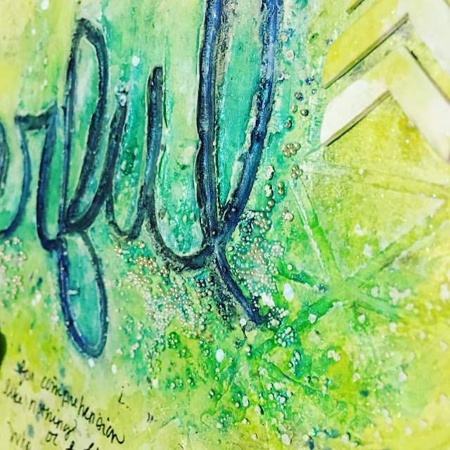
I layered heavy gel medium onto my altered book pages with my finger, then layered texture paste through this Heidi Swapp stencil.  Love these triangles!

page 3

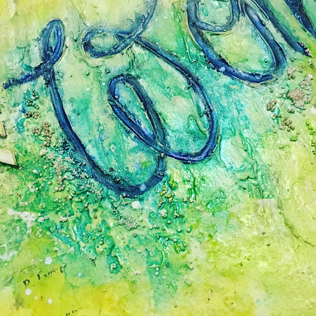
Then I layered Twinkling H2Os over and over until I got just the right puddling.  I used a writing brush to do a more concentrated wash inside the letters.  Finally, I used Mod Podge to adhere beads for extra sparkle.

page 5

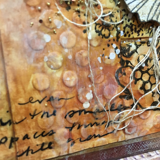
For texture I stamped a beautiful scripture stamp by Verve randomly along the edges. Then I stamped my favorite Penny Black lace and a Finnabair texture stamp with water based inks, spritzing the stamps with water each time.

page 6

I'm playing along with:

Feb 28, 2016

Waiting for Spring Dimensional Cards Four Five and Six

card 1

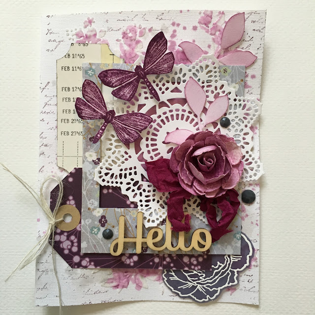
Day two of my cardmaking extravaganza.  First up is my card for challenge four, chipboard.  I layered some old favorite papers along with some handmade embellishments.  I stamped and cutout the Hero Arts dragonflies and also made the paper flower with the Tattered Florals die.

card 2

I just love the all of the elements Elena Morgun has challenged us with, especially stamping on vellum.  Here's another Stampendous flower on purple vellum.  The background features my new Tim Holtz floral stencil and watercolor with Seedless Preserves and Pumice Stone Distress Inks.

card 3

For the second challenge we are to take inspiration from one of Elena's YouTube videos.  I chose THIS awesome project and followed a lot of the details just as she showed.

card 4

Again using the new Tim Holtz floral stencil and stamping on vellum, this time on pearlescent vellum.  For this background and the next I used Twinkling H2Os.

card 5

The quote reminded me of Elena's generosity in creating such a lively community to share our passions for art, and also of my awesome bloggy friends.  Love y'all!!

card 6

On the last card I used another Tim Holtz stencil to do a monoprint technique, then layered color with the H2Os and white embossing.

card 7

I am so into this background and into playing with watercolor this way!  It was fun to continue to use each challenge's theme in the following cards!

card 8

I added a beautiful Verve sentiment that was so appropriate for the theme, Waiting for Spring.

card 9

I'm happy to share my projects with Elena Morgun's Waiting for Spring challenges all found HERE.
Waiting-For-Spring

Feb 27, 2016

Waiting for Spring Dimensional Cards One Two and Three

card 1
 I recently found Elena Morgun through YouTube and immediately fell in love with her awesome style.  I started following her instantly and have watched countless videos of hers.  But I just just discovered her amazing blog and am about 6 weeks late to this awesome card party "Waiting for Spring" she's throwing. Nevertheless, I just had to jump in head first and play along.  My first card, much inspired by Elana's work, featuring vellum.
card 2
 I went crazy embossing on blue vellum, including flowers, butterflies, and my sentiment.  This quirky focal point is a Hero Arts stamp that I fell in love with as soon as I saw it and have been dying to use it, but couldn't figure out what to do with it.  I just knew it would be the perfect focal point for a spring card.  The flowers are Stampendous and butterflies and sentiment are Unity.  Many thanks to Stampendous and Heather from Houses Built of Cards for these awesome giveaways that I won.  <3
card 4
The dies are Tim Holtz and background is Basic Grey hoarded paper that I stamped and embossed with this awesome unmounted I have had for years and years, and a XL dry embossing plate I scored from Tuesday Morning.
card 5
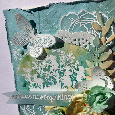
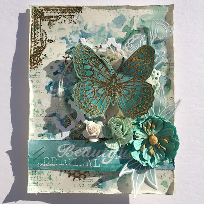
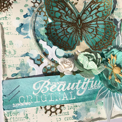
 My second card features a stencil.  This card is my favorite of the three.  I made my background with a Prima stencil and watercolors, layering the two colors after heatsetting in between.  The butterfly is Stampin' Up! and vellum flower and sentiment another Unity, and leaves Stampendous.  The awesome corner in the top is Tim Holtz and the honeycomb is Stampers Anonymous.  The text in the background is Catslife Press, an old favorite.
card 6
 You can barely see the dots I stenciled in white over my Prima stencil, but it's a great contrast IRL.
card 7
 I so love this background and have to do more of this, as they always turn out to be my favorites.
card 8
 I just love the white vellum, which I carried from theme one.  The doily is a coffee filter by MFT.
card 9
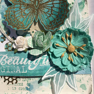
For my third card I have used three kinds of flowers.  This was hard for me because I don't buy a lot of premade flowers.  I am such a cheapskate!  I can hardly bare to use $5 worth of flowers on one card!!!  But I am trying to let myself go and quit worrying about those things when I create.
card 10
 My main flower is by Prima, the wooden flower I have had for years and years, and the third type of flower is cut from scrapbook paper.

card 11
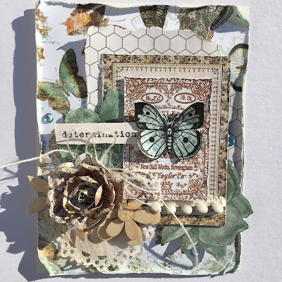
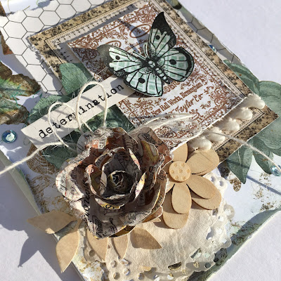
 I layered a Hero Arts butterfly over this Stampers Anonymous label stamp and then over a pretty piece of paper.  I love the pom pom fringe, the coffee dyed leaves, and the coffee filter doily here.
card 12
 I'm sharing my cards with Elena Morgun's challenges:
Waiting-For-Spring
To find out about all of the challenges in this series and to see Elana's awesome video inspiration click HERE.  Trust me, you will be so inspired by Elana and the artists in the linkup!  

Feb 25, 2016

Layer Upon Layer of Mixed Media

page 1

Today I am privileged to be guest designer at Frilly and Funkie for their fabulous new challenge, "Layer It Up!"  We are asked to create a shabby chic or vintage project that includes multiple layers.  Isn't that exactly what we love doing?!  Yes!  I decided to created a layered project with minimal bulk for my altered board game book, tutorial HERE.

page 2

I built my base layers with watercolor paper, some which was dry embossed.  I was very pleased with the result and how the watercolor pooled around the raised areas.  I adhered the papers with matte Mod Podge.  While it was wet I began pooling my watercolor.  I was quite impressed with the way the watercolor mixed with the Mod Podge and formed a glaze of sorts.

page 3

Here you can see how I recycled the perforations from my watercolor pad in the background.  I really loved the pooling in the squares.

page 4

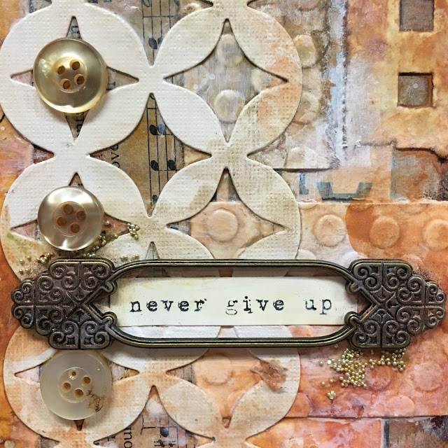
To bring back some contrast, I added a white Tim Holtz Alterations die cut.  I lightly colored it in areas.  I used a fat watercolor brush for all of the color, spritzing with water as needed.  I also added some Perfect Pearls in areas and a microbead/glitter combo.  I loaded my brush with Mod Podge, then dipped into the jar and brushed it onto the page.

page 5

Then I thought it would be fun to stamp this awesome detailed unmounted stamp by IndigoBlu over the layers.  It worked really well!  I did not put the stamp on a block, rather used my fingers to push it into the crevices of my page.  I added some journaling and splashes of watery gesso.  I stamped the image onto a scrap of Prima scrapbook paper and fussy cut the flowers, then mounted like so.  I tucked some string in for texture and highlighted the flower centers with a cut up ball chain.  After seeing my buddy Sara Emily using chain lately I dug through my hardware bin and found one tiny piece of chain.  I used jewelry snips to cut it apart.

page 6

To balance my page, I went back with a wash of super watery gesso in areas for contrast.  It has rained here for days, so excuse the dreary photos.  The color is so much prettier in person, especially with the metallic hints from the Perfect Pearls powder.

Thanks so much Frilly & Funkie for having me!  Do check out the design team and their fabulous creations.  I hope you are inspired to share your project in the Layer it Up! challenge HERE.  Everyone who enters and adheres to the challenge guidelines will be entered into a drawing to win a $25 spending spree at The Funkie Junkie Boutique!  Linda has an amazing array of new items in her awesome shop, so jump right in.
page 7

I'm also entering these great challenges:

You are invited to the Inlinkz link party!

Click here to enter

Feb 21, 2016

Flowers Keys and Doilies Mixed Media Layout

page 1

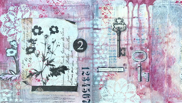
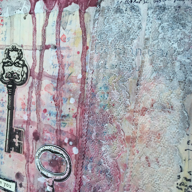
Today I am sharing more from my experimentation in watercolor with you from my new altered book.  I am really loving learning this medium.  For this spread I covered my pages with an old ledger page and some sort of holey paper.  Then I added the lace, all with matte Mod Podge.

page 2

I really love the pools in the lace.  I go back and dry brush gesso over the lace to further accent the pattern.

page 3

I let the ink drip this way and that.  Notice the ledger peeking through.

page 4

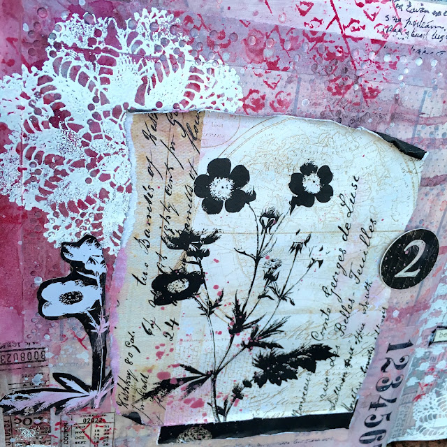
Next I started building my layers with Prima texture stamps.  I stamped some in red and then decided to emboss in white to add contrast.  I love the flexibility of using unmounteds on a textured surface. I don't put them on a block, just use my hands to press them down into the cracks.

page 5

I added some washi tape and rub-ons, then stamped the Prima script in black.

page 6

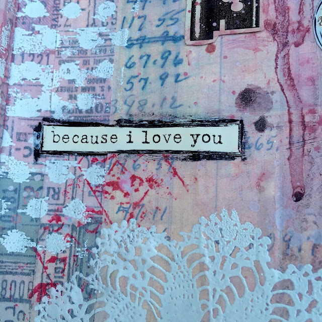
I added this grungy love sentiment and outlined it with black marker, which I smeared with my finger.

page 7

I used Prima scrapbook paper to create the focal points in my design.  This paper is so awesome!  I could kick myself for only buying one sheet!

page 9

And another close up of this awesome sentiment and ledger.  And the entire layout below.  I truly love this Prima doily stamp and how beautifully it incorporates as both pattern and contrast.

page 10

I'm sharing with these fabulous challenges:
PPP FEB 16
SSS: Recycle/Upcycle Style (altered book, ledger page, and holey paper are upcycled)

Feb 18, 2016

Mixed Media Altered Book and Recycling

page 1

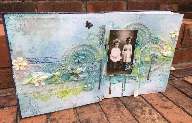
I promise I have not fallen off the face of the earth.  Rather, this weekend we went on a little trip.  It was much needed for my family.  We rode up to Charlotte.  Besides doing nothing, my goal was to find a great book to alter.  I hit the jackpot and found this book that is almost square.  I love the format!  My criteria when altering a book are: 1. cloth cover and 2. stitched signatures and 3. size.  This book had it all!  The only down side was that the pages were glossy photography.  But I decided I would either cover them with text pages, scrapbook paper, or gesso them as is.  On the way home I removed all of the pages except the first page set of each signature.  When I got home I went straight away into the studio to play.  Honestly, I have been feeling a little overwhelmed with trying to fit different elements into my art based on the challenges I participate in.  I decided to remedy that by sitting down to play with no preconceived notions about what "needed" to go into my pages.  What good fun!  I am still struggling a little and feel an "artist block" has come upon me, but am determined that I will play until it passes.

page 2

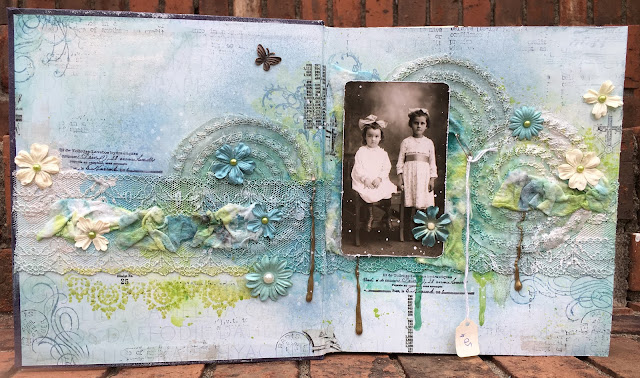
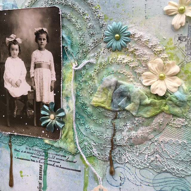
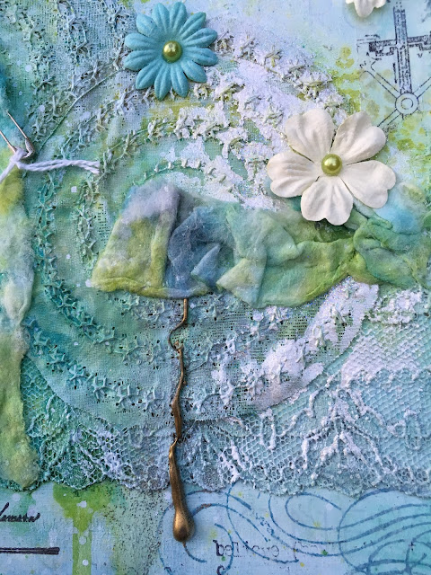
For my first spread I gessoed the blue pages lightly, allowing the original text to show through.  My friend Barbara passed a section of this sheer embroidered curtain panel to me, once she grew tired of them hanging in her home.  I cut each circle out with fabric scissors and then used matte Mod Podge to adhere them and the lace strip to my pages.  I cut the lace in the middle after gluing it down so the book would open and close properly, but that is hidden in the spine.

page 3

I just love how these stitches showed through in my layers of gesso and watercolor.

page 4

Another part of my play was to try embossing hot glue drips.  I decided I am not a fan of this...  For one the EP got wedged in my lace and made it look dirty.  Boo!  Also, I don't know if it is because my glue gun cost $3, but I couldn't get the glue to glob out properly like a water drop...  So I stopped after three blobs.  Kudos to you girls who make this look amazing!

page 6

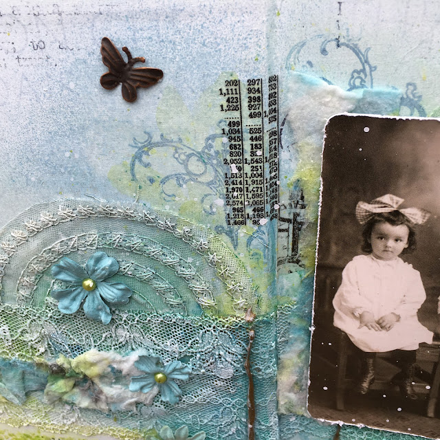
This is one of my favorite sections.  I stamped this Tim Holtz stamp in lime ink, spritzed heavily with water below a section of lace.  I just love how the ink pooled.

page 7

To embellish my page I tore the baby wipe I used during the process into long strips and wadded it down into glue.  Loved this discovery!  To conceal some of the ugly "dirty embossing" I spackled some dried up Lumiere paint over the lace.  I have several bottles of this that have dried up and I am going to use this way.   Most of the stamping was done in Archival Ink in Cornflower blue.  The black is either a rub on or stamp from 7 Gypsies.  The wee little metal butterfly was a gift from my friend Madelyn - thanks Mad!!!

page 8

I used this image of these darling little girls from the Found Relatives collection by Tim because they remind me of how my Grandma would buy me pretty dresses from the big department store, even when they were too expensive for us.  The little price tag is representative of how little the cost really was compared to the value of those precious memories.

page 10

This is the first altered book I have made in over ten years (and Linda Findley if you're reading I was thinking of you every step of the way).  I'm sharing with:

Popular Posts