Showing posts with label paintings. Show all posts

Feb 12, 2024

How to Use Painty Papers to Create a Junk Journal


Hi everyone!  This year I've made a goal of getting more into mixed media art and less into cardmaking.  MM has always been my passion, but not necessarily my priority, so I'm working to change that. The process will include lots of exploration and I'll share with you what I can.  I've signed up for the Cathy Nichols Joy of Painting course for 2024.  One of the bonus courses was on creating large free paintings on giant papers.  I've been doing free paintings for years, but the idea of painting onto large papers was super exciting to me so I had a play with a friend and we ended up creating a pile of free paintings or painty papers...


I just love seeing them all rolled up.  I shared a video on Instagram with more details @sewpaperpaint.    Below is the paper I used to create this new journal.  The paper we used was thick and white and similar to kraft paper/gift wrap/package wrap?


I used the back of a watercolor paper pad to cut my two chipboard covers to 8.75x5.75", which is just larger than a sheet of paper folded in half.  I wrapped the two pieces of chipboard with the art paper, AFTER taking good photos/scans to use for other things (see below).  I mitered the corners and covered the inside (end papers) with neon gel prints.  


I had a small scrap of the painty paper left and made some scallops to decorate the end papers.


I created a closure by making a paper button, inspired by Francisca Nunes and tied a piece of sari ribbon to the back cover to wrap around the button.  


To create the spine, I cut a piece of cardstock 8.5x4.5" and scored from 1" to 3.5" every 1/8".  This creates a nice flexible "round" spine for the book.  I then glued the unscored 1" sides to the inside front and back covers I had made.  On the outside I adhered some beautiful vintage fabric over the cardstock, adhering only to the covers, not the actual cardstock.  I then repeated with the inside using the same fabric.


I used my Crop-a-dile to adhere three gromets to the top and bottom in increments. These simply tie around the tea stained copy paper inserts I made and stapled together using a long reach stapler.  I mixed in some folded book pages and clear page protectors to use as pockets to create really unique inserts.  


It was so much fun making this journal and I hope to fill it with everything I learn from the year long Joy of Painting course!  


I mentioned making copies of my painty papers...  Well here is how I used some of those!  First, I'm creating color charts of my experiments so I can easily reference the colors when I need inspiration for a new project...  I simply die cut a square from a large sheet of thin chipboard and used the negative space as a view finder to look for happy moments within the paper to cut out and highlight as shown.  I added in the PaperArtsy Fresco Chalk Acrylic paint colors to coordinate by finger painting!  FUN!


I used some of my prints to create some envelopes for my journal.  The flowers come from a practice painting I made and color copied.  It was fun to dig out my old envelope making templates from the 90's!  


I also covered some tiny composition notebooks from the Dollar Tree, which you can buy in bulk HERE.  I gave the notebooks with a matching neon pencil to my artsy friends for Valentine's Day.  I hope you've enjoyed seeing these projects, as I've had such fun creating them!  xx, Autumn


May 23, 2016

Finnabair Inspired Canvas With Die Cuts

canvas 1

Last Saturday at my monthly art group meeting, Linda led is in creating a Finnabair style canvas.  I was inspired by THIS YouTube video to use a black background.

canvas gesso

At the class I was only able to get my items glued down and painted with black gesso.  Yesterday I finally had a chance to finish the project.  I wanted to use my  mom's stash of Radiant Pearls for the highlights.  To make them show up on the black, you must first brush white gesso to create highlights.  Then when you apply the Radiant Pearls they really pop!

canvas 2

I have never attempted such a piece because, quite frankly, it tears my nerves up to put so many embellishments on one project.  I guess that comes from my frugal nature, but Finnabair herself always says she doesn't like to limit herself with embellishments.  I gathered many practically free items for this first test run.  Some clearance flowers, wooden tokens, buttons, bottle caps and some filigree flowers I found 3/$1 at Tuesday Morning.

canvas 3

The inspiration video sparked the idea of using die cuts.  Can you believe these butterflies are Stampin' Up! dies?!  The Tim Holtz Ornate Frame was the perfect backdrop for them.  I cut two of each from thin chipboard and glued them together for stability.

canvas 4

One of the prettiest elements in my opinion was the addition of this awesome shaker substance by  Suze Weinberg that I found in my  mom's stash.  She had four bottles full, never opened.  I attached them with Mod Podge.  They are like tiny sequins, but a little thicker.  The color was perfect.

canvas 5

Mar 17, 2016

Watercolor Collage Canvas for AVJ


Today I have one of the greatest blogging honors, to be featured at A Vintage Journey as a Pinworthy Guest because of my Poinsettia Triptych from the A Vintage Christmas challenge.  The AVJ group of ladies never ceases to amaze and inspire me and I am so thankful for the invitation.  You can find my guest post HERE.  AVJ is celebrating a birthday and for this month's challenge we are all asked to use the same Destination Inspiration travel bag, consisting of:
Substrate – Board (eg - grey board, coaster board, cardboard, chipboard) 
Main Colour – Lilac or pale purple 
Technique – Rust Effects (perhaps using rusting or embossing powders or rust coloured paints) 
Product – Something metal 


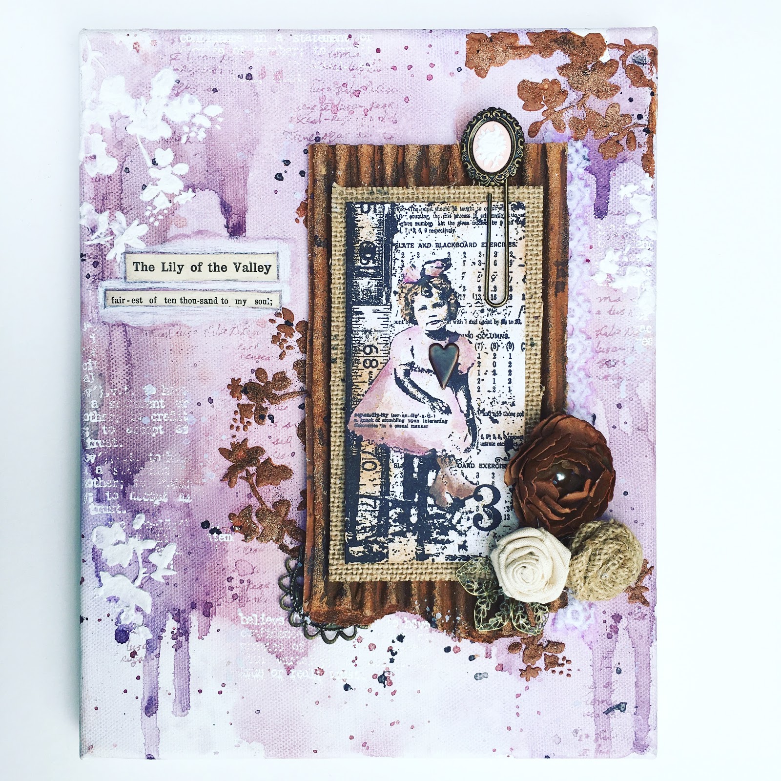
So let's get started with my interpretation.  Pardon this night time photo from my studio, but I wanted you to see the watercolor base I created on my canvas.  I puddled color, then spritzed it to move it around and eliminate any hard edges.  I plopped and flecked as I went, letting some areas dribble down and also heat setting between colors.  I used a mix of purples and browns.  I could literally do this all day!


Then I got really excited and took no more photos until the after.  Ha, sorry!  But a lot of closeups should explain...  I embossed in white a text stamp randomly, not pressing the stamp fully and brushing off any powder where a "hard line" formed - these are my highlights.  I also stamped a script stamp in lavender ink to create my lowlights, as well as the black flecks. 


Next I mixed sand based texture paste with rust colored acrylic paint and spackled through Tim's new mini layering stencil.  I really love this floral pattern, especially the dots around the various flowers.  I sprinkled three shades of Distress embossing powder into the paste lightly, just for the gritty texture, then heatset.  This powder doesn't react to heat the same way that regular EP does, so the result was grainy, and rustlike.


For my focal point, I chose Tim's sweet little girl and layered her over a burlap panel and a rusty corrugated panel.  I painted it with brown and rust acrylics, then tapped with embossing ink and lightly sprinkled with the same Distress EPs.


The little girl and her curls reminded me of myself somehow...  I added a section of vintage hymnal, a song that my Grandmother and I would sing together on long nights when I had terrible nosebleeds that seemed endless in those wee hours.  She always helped me and was always cheery and loving in doing so.  Those nights singing with her are some of my fondest memories now.


I went back and added some more flowers through the stencil in white for a little more contrast.


This rusted cardboard reminded me of Sara Emily's fabulous "tin roof" from her AVJ guest post HERE.  Thanks Sara Emily for the awesome inspiration!


Lastly, I attached a few embellishments.  The darkest flower was made using Tim's Tattered Florals Die and kraft paper.  I brushed it with a watery mix of rust paint to give it a little dimension.

Feb 25, 2016

Layer Upon Layer of Mixed Media

page 1

Today I am privileged to be guest designer at Frilly and Funkie for their fabulous new challenge, "Layer It Up!"  We are asked to create a shabby chic or vintage project that includes multiple layers.  Isn't that exactly what we love doing?!  Yes!  I decided to created a layered project with minimal bulk for my altered board game book, tutorial HERE.

page 2

I built my base layers with watercolor paper, some which was dry embossed.  I was very pleased with the result and how the watercolor pooled around the raised areas.  I adhered the papers with matte Mod Podge.  While it was wet I began pooling my watercolor.  I was quite impressed with the way the watercolor mixed with the Mod Podge and formed a glaze of sorts.

page 3

Here you can see how I recycled the perforations from my watercolor pad in the background.  I really loved the pooling in the squares.

page 4

To bring back some contrast, I added a white Tim Holtz Alterations die cut.  I lightly colored it in areas.  I used a fat watercolor brush for all of the color, spritzing with water as needed.  I also added some Perfect Pearls in areas and a microbead/glitter combo.  I loaded my brush with Mod Podge, then dipped into the jar and brushed it onto the page.

page 5

Then I thought it would be fun to stamp this awesome detailed unmounted stamp by IndigoBlu over the layers.  It worked really well!  I did not put the stamp on a block, rather used my fingers to push it into the crevices of my page.  I added some journaling and splashes of watery gesso.  I stamped the image onto a scrap of Prima scrapbook paper and fussy cut the flowers, then mounted like so.  I tucked some string in for texture and highlighted the flower centers with a cut up ball chain.  After seeing my buddy Sara Emily using chain lately I dug through my hardware bin and found one tiny piece of chain.  I used jewelry snips to cut it apart.

page 6

To balance my page, I went back with a wash of super watery gesso in areas for contrast.  It has rained here for days, so excuse the dreary photos.  The color is so much prettier in person, especially with the metallic hints from the Perfect Pearls powder.

Thanks so much Frilly & Funkie for having me!  Do check out the design team and their fabulous creations.  I hope you are inspired to share your project in the Layer it Up! challenge HERE.  Everyone who enters and adheres to the challenge guidelines will be entered into a drawing to win a $25 spending spree at The Funkie Junkie Boutique!  Linda has an amazing array of new items in her awesome shop, so jump right in.

page 7

I'm also entering these great challenges:

You are invited to the Inlinkz link party!

Click here to enter

Feb 21, 2016

Flowers Keys and Doilies Mixed Media Layout

page 1

Today I am sharing more from my experimentation in watercolor with you from my new altered book.  I am really loving learning this medium.  For this spread I covered my pages with an old ledger page and some sort of holey paper.  Then I added the lace, all with matte Mod Podge.

page 2

I really love the pools in the lace.  I go back and dry brush gesso over the lace to further accent the pattern.

page 3

I let the ink drip this way and that.  Notice the ledger peeking through.

page 4

Next I started building my layers with Prima texture stamps.  I stamped some in red and then decided to emboss in white to add contrast.  I love the flexibility of using unmounteds on a textured surface. I don't put them on a block, just use my hands to press them down into the cracks.

page 5

I added some washi tape and rub-ons, then stamped the Prima script in black.

page 6

I added this grungy love sentiment and outlined it with black marker, which I smeared with my finger.

page 7

I used Prima scrapbook paper to create the focal points in my design.  This paper is so awesome!  I could kick myself for only buying one sheet!

page 9

And another close up of this awesome sentiment and ledger.  And the entire layout below.  I truly love this Prima doily stamp and how beautifully it incorporates as both pattern and contrast.

page 10

I'm sharing with these fabulous challenges:
PPP FEB 16
SSS: Recycle/Upcycle Style (altered book, ledger page, and holey paper are upcycled)

Popular Posts