Mar 30, 2016

Variegated Embossing with Stencil Paste

book

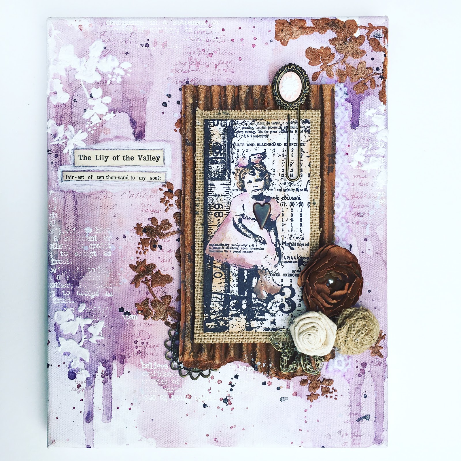
Just a quick post today to share this rather unusual journal spread.  I picked out this couple from Tim's photo booth stash and found him and her in their younger years, or so we'll imagine.  I decided this trio of images would make for an interesting composition.

book 2

For the circle stencil, I cut a Tim die twice from plastic, butting the flatter side together so the pattern would repeat nicely.  I used texture paste and then carefully poured pewter, gold, and copper embossing powder over the paste (one color at a time) to create this variegated look, though some of the pewter is lost in the sea of ochre watercolor.

book 3

I have treasured this hand dyed lace remnant, given to me by my dear friend Barbara, for ages.  I decided it would make the perfect little bundle with a Tim leaf die, some string, and a rhinestone.

book 4

Each image in my trio is backed with a piece of metallic kraft core embossed with one of Tim's tree folders.  I worked hard on this for last month's AVJ challenge, but it just didn't come together.  I ripped it apart and used little sections here to create my frames.

book 5

I tried to embrace the industrial/steampunk side of altered art with all this metal, even adding a little stamped hot air balloon.  I hope I get credit for trying.  I just don't own any gears!

book 6

Honestly, this couple makes me laugh.  They look like the couple at the Crackle Barrel that never speaks while they eat.  Anyway, they lived a long life together and decided long ago to just be themselves.  Gotta give 'em props for that!

book 7

I'm sharing my spread with:

You are invited to the Inlinkz link party!

Click here to enter

Mar 23, 2016

Mixing Naturals with Brights in Mixed Media Journaling

book 1

I am so excited about the new challenge at Anything But Cute because it really pushed me to question something I've always believed in.  When people talk about color and disliking certain colors, I always reply that I love all colors!  I feel my journal is a safe place to experiment with color combinations and test drive colors I don't normally use.


That is exactly what I've been doing in this cardboard junk journal.  But super bright colors are really hard for me, like I said when I did the red cards for IndigoBlu.

book 2

For these pages I wanted to pull out the super saturated colors in my go to combo: blue and green.  But I just had to balance the brightness with some natural elements.  I think the wooden buttons, the cardboard, and the use of whites gave me that balance.

book 3

I glued some hymnal pages to my cardboard pages, but did not seal them with Mod Podge this time, because I wanted the full saturation of color to soak into the paper.  Then I added the stencil paste after so I could get the white contrast.

book 4

This Tim Holtz found relatives image speaks to my heart so much.  You may not know, but I have four children and had three additional foster children for six months.  My grandmother was one of 13 children as well.  Big families are so amazing, but come photo time trying to get everyone to smile and look pretty is not an easy feat!

book 5

I decided to create a frame for these darling faces by cutting out the top layer to reveal the corrugated cardboard.  Then added the string to messy things up a bit.  Life is never perfect.

book 6

I decided to go for some more repetition of pattern on the other side as well, stamping and cutting more diamonds.  Part of me loves mirroring this way, but then I don't know.  What do you think?

book 7

The brown areas are actually gold.  I am loving using Glimmer Mists in my work these days.  I love the juxtaposition of my dull watercolor and the shiny patches.

book 8

The quote is sort of a pun, but also represents how as a mom you feel best when all the kiddos are at home or with someone you know will mother them as you would.

book 9

I'm surprised at how well the humble jute binding has worked in my journal.  I had planned to rebind the book when I was finished, but now think I will leave it be.  It really goes well.  Thanks for taking a look today and I do hope you were inspired in some way.  I love reading your thoughts and appreciate ever word.

book 10

I'm linking up to:
SSS: Rain or Shine (because of the cardboard "sunshine" and watery colors)
You are invited to the Inlinkz link party!
Click here to enter

Mar 21, 2016

Making Stencils from Die Cuts for Mixed Media

book 1

Today I am sharing another spread from my cardboard junk journal.  I am having so much fun getting messy these days.  Here I used layer after layer of Prima papers to build up a frame of sorts for my focal image, a Tim Holtz photo booth image.  I love the look on this gal's face.

book 2

I took a sheet of thick plastic and made some stencils with my new Tim Holtz die cuts.  This is a great way to double the use of your dies.  If you have problems cutting through the plastic, try putting a sheet (or two or three) of thin cardstock on the back of one of your plastic plates.  This acts as a shim and puts a little more pressure on the die.  Plastic folders from the office supply store are a cheap option for stencil material.

book 3

After I used crackle past through my DIY stencil, next came the fun part, mixing watercolor puddles everywhere!  I loved adding black Glimmer Mist here and there and the unique sparkle it left.

book 4

I also stamped a Prima script stamp randomly and added some handwriting.

book 6

I tried to keep the bulk down in this book so it will lay flat and be stored nicely on my bookshelf.  The great thing about the cardboard pages is that you can push the embellishments down into the cardboard.  The corrugated section has a little give way.  Love that these rhinestones didn't bulk up the pages too much.

book 7

I decided to put the second of my hydrangeas from my Martha Stewart punch on this journal page.  Hydrangeas are my favorite flower.  I once read of a homeowner who bought a farmhouse and planted over 100 hydrangea bushes when she first moved in.  Years later her home was featured in Country Living and was the most beautiful I've ever seen!  I hope to do this if we ever move.  :)  I hope this last pic shows you the balance of light and dark on the spread.  It is quite dramatic, but I was pleased with it.  Let me know what you think.  <3

book 8

I'm playing along with:

Mar 17, 2016

Watercolor Collage Canvas for AVJ


Today I have one of the greatest blogging honors, to be featured at A Vintage Journey as a Pinworthy Guest because of my Poinsettia Triptych from the A Vintage Christmas challenge.  The AVJ group of ladies never ceases to amaze and inspire me and I am so thankful for the invitation.  You can find my guest post HERE.  AVJ is celebrating a birthday and for this month's challenge we are all asked to use the same Destination Inspiration travel bag, consisting of:
Substrate – Board (eg - grey board, coaster board, cardboard, chipboard) 
Main Colour – Lilac or pale purple 
Technique – Rust Effects (perhaps using rusting or embossing powders or rust coloured paints) 
Product – Something metal 


So let's get started with my interpretation.  Pardon this night time photo from my studio, but I wanted you to see the watercolor base I created on my canvas.  I puddled color, then spritzed it to move it around and eliminate any hard edges.  I plopped and flecked as I went, letting some areas dribble down and also heat setting between colors.  I used a mix of purples and browns.  I could literally do this all day!


Then I got really excited and took no more photos until the after.  Ha, sorry!  But a lot of closeups should explain...  I embossed in white a text stamp randomly, not pressing the stamp fully and brushing off any powder where a "hard line" formed - these are my highlights.  I also stamped a script stamp in lavender ink to create my lowlights, as well as the black flecks. 


Next I mixed sand based texture paste with rust colored acrylic paint and spackled through Tim's new mini layering stencil.  I really love this floral pattern, especially the dots around the various flowers.  I sprinkled three shades of Distress embossing powder into the paste lightly, just for the gritty texture, then heatset.  This powder doesn't react to heat the same way that regular EP does, so the result was grainy, and rustlike.


For my focal point, I chose Tim's sweet little girl and layered her over a burlap panel and a rusty corrugated panel.  I painted it with brown and rust acrylics, then tapped with embossing ink and lightly sprinkled with the same Distress EPs.


The little girl and her curls reminded me of myself somehow...  I added a section of vintage hymnal, a song that my Grandmother and I would sing together on long nights when I had terrible nosebleeds that seemed endless in those wee hours.  She always helped me and was always cheery and loving in doing so.  Those nights singing with her are some of my fondest memories now.


I went back and added some more flowers through the stencil in white for a little more contrast.


This rusted cardboard reminded me of Sara Emily's fabulous "tin roof" from her AVJ guest post HERE.  Thanks Sara Emily for the awesome inspiration!


Lastly, I attached a few embellishments.  The darkest flower was made using Tim's Tattered Florals Die and kraft paper.  I brushed it with a watery mix of rust paint to give it a little dimension.

Mixed Media Watercolor Techniques

book 1

Hey guys and welcome to the first page from my new junk journal.  A girl I work with was saving these thick pieces of cardboard and I asked her for them.  I cut them in half and bound them with jute.  I am LOVING working on cardboard as a substrate for mixed media.  I first gesso the page and then go to town wetting and painting.  The pages do not curl and the book lays perfectly flat when open.  WIN WIN!  I can't wait to share my experiments with you.  <3

book 2

After my Grandfather passed away, my Aunt gave me all of his old keys that she couldn't find locks to fit.  He was the town lawn mower repairman and Mr. Fix-It.  I have kept all of the keys on the ring until now, when I finally found a home for this one.  He would know exactly what it was for, he was so smart.  I love the sense of wonder that I feel when I look at it.  Whatever it locked, I will never know...

book 3

These photos really don't show the texture and dimension on the pages well.  The triangles are a huge part of the design IRL and really pop off the pages.

book 4

I did manage to take one quick before photo so you could understand my process a bit better.  You see the layers of torn papers and stamping over the gessoed background.  A special shout out to my homey Mimi for sending me the sweetest package this week.  She lovingly filled it with great bits of ephemera, even some of her coveted library cards.  She included a sweet note in the package explaining all of the bits and bobs and I just had to use it in my layering!  Mimi and I share a love for triangles!  ;0

book 5

I chose this mysterious girl from Tim's photo booth collection as my focal point.  She is surrounded with a Prima triangle stamp, embossed in gold.

book 6

You can see a little more detail of the watercolor puddles and splatters here.  Spritzes of Glimmer Mist balance the very matte Loew Cornell watercolor.  I have been testing out some of the other brands I have recently.  I used an old Prang set leftover from art school and they work beautifully, but ALWAYS react to water, even after dried.  The Loew Cornell dry almost permanent, which is my preference for this type of mixed media.  The only down side is the pigments will separate if you add too much water and the result is a sort of powdery, cracked finish.  I have learned to watch out for this and correct as I go.  When using Glimmer Mists I find it better to use on top of these watercolors.  For my brighter cards last week, I used Dr. PH Martin's inks.  They are permanent and can easily be made into sprays, which won't bleed.  They are fantastic for spraying through stencils!  I just need to get a couple of palettes so I can better mix my own colors.

book 7

Back to my pages!  I decided to use more handwriting in my journal.  The 2nd Class stamp is sort of a pun about how frugal Mimi and I are.  I just had to incorporate it.

book 8

book 9

I'm sharing with:
Scrapki

Mar 15, 2016

Woodland Paper Doll Altered Book Spread

book 1

 Hi everyone!  Today I am sharing something a little different with you, a little fairy tale.  This spread in my new altered book is focused around one of my woodland series of paperdolls.  They are some of my favorite work from the past year, but I haven't shared them because I wanted to create them a "home" first.  I just haven't been able to get that together, so I pulled one of my favs for this spread.  Maybe I will recreate her for that project later.  Anyway, I started collecting images in THIS Pinterest board.  I resized them in a Word document and printed them, then pieced together the parts to my fancy and colored them with inks and my Colorbox stylus.  The wings and boots are Character Constructions paperdoll stamps by Cathrine Moore.

book 2

Basically, my little fairy tale is about a group of critters who live in the woods near a park.  They spend their days watching the children's birthday parties, longing for such a grandiose event of their own.  Then one day, our girl Bertha, gathers together all of the odds and ends, discards from the humans that she's been collecting and suggests to the others a soiree of their own.  A costumerie is born...  That evening the park is transformed into a magical gathering of the most amazing friends.

book 3

For my background I played with spray inks and Glimmer Mists over a Tim Holtz burlap stencil.  I used Tim's tattered leaves dies on book pages to create the faint leaves in the background.

book 4

I hand stamped the text onto the type writer with a mini alphabet set.  Some random stamping in the background with 7Gypsies stamps and the larger butterflies are Tim's.

book 5

And here's our girl in her finery.  What fun!  I hope you'll be inspired to see paperdolls in new ways.

book 6

I'm playing with these awesome challenges:
Our Creative Corner: Return of the Challenge - I chose What Makes You Smile (Paperdolls!)

Popular Posts