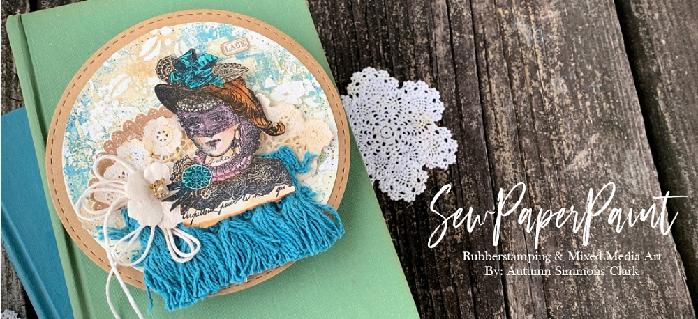

At first thought, you might not think this is a journal made from gelli prints, since most people visualize "gelli prints" as bold and vibrant. In fact, you can make gelli prints from any color palette you can think of. Since I am drawn to neutrals and earth tones, I've chosen a range of Fresco Chalk Acrylics by PaperArtsy to include: Blue Oyster, Waterfall, Toad Hall, Sage, Hint of Mint, Taupe, Concrete, Cloudy and Chalk. There are many techniques in which you can use stencils with your plates, but I prefer to make more "solid" pages that pick up the under paint and texture but still serve as blank canvases for me to use with my rubber stamps. If you would like to see how I finished this book with PaperArtsy stamps, head on over to the PaperArtsy blog for the details.

I learned this style of book making from Elena Morgun. To start, I cut three sheets of 11x14" bristol in half to make six 11x7" panels. I printed both the front and back of each panel with my range of colors. I three of my six sheets and prepared two like the first image and one like the second (which makes fun flaps). This gave me three inserts for my book, plenty of pages to collage.


Next, I cut my covers from medium chipboard. I added 1/8" to the finished page measurement (7 1/8 x 4 5/8"). I decided on the thickness of my finished book and cut that width times the finished height (1 1/8 x 7 1/8"). You could definitely add more pages and make a thicker book if you'd like. I glued the chipboard to fleece/batting with a nice 1/4" gap between the covers and spine (to allow plenty of wiggle room for the covers to open and close with all the bulk). I cut around the edges so the fleece was only on one side.

You could omit the fleece and fabric and use paper for your cover, but I wanted a vintage style book and I love how soft the book feels in my hands. I cut a piece of fabric just larger than my covers and glued the top and bottom edges around them as shown. I use Beacon 3 in 1 or Beacon Mixed Media glue for this. You do not add glue to the fleece side or else it would show through on your finished cover. Pull the sides taught and rub them firmly into the glue.

Next, cut the corners as shown to miter, making sure not to cut too close to the chipboard corner so it will wrap nicely.

Apply a tad of glue along the fabric edge and then a bead along the chipboard. Fold the edge in and adhere to the chipboard.

This is what your mitered corners will look like. This is the time to add a closure if you like. I used torn fabric strips, but you can use any non-bulky trim.

I took one of my three leftover printed papers and cut it in half, then glued it to the inside back of my covers. I carefully formed a crease in the area between the back cover and the spine. Once it was burnished well, I glued the other half on the other side and creased it too. This cut helps your book to have a little give when you open it. By gluing the back then the front, it becomes almost invisible.

I then added three medium eyelets to each end of my spine with my Cropadile. You can add more if you've chosen to make your book thicker.

I took my inserts and marked with a pencil the placement of the eyelets on the back of the fold. I punched these marks with the smaller punch on my Cropadile.

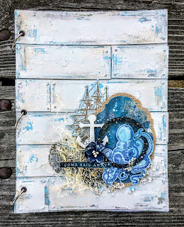
I used every smidgen of my leftover prints for stamping, die cutting and collage.

Once I designed my pages the way I wanted, I simply tied them into my covers as shown.

Then I was able to focus on my cover collage. Now hop on over to the PaperArtsy blog to see how I finished my journal. Thanks so much for joining me today and don't forget to pin this project for future reference.
Check out these other journals/album tutorials with PaperArtsy stamps:
(Click on the photo for the full post)

I'm sharing with:


5 comments:
What a gorgeous journal Autumn - love your muted colours and textured gelli prints - they look so much more achievable than some of the elaborate ones I see..
Blessings
Maxine
Gorgeous album, Autumn! I love everything about it! :o)
WOW!! This is AMAZING and simply gorgeous! You are SO talented my friend! Great job! And your colors are very eye appealing! Awesome!
Your journal is incredible and I especially like the color palette you've used! Thank you for sharing the tutorial; I'd never have thought of using gelling prints!
Hi Autumn. This project is stunning. As usual, you have knocked it out of the ball park. Just so nice to look at with all of the wonderful details. I understand about the gelli printing with muted subtle paint colors. I had to learn how to gelli print using only monochromatic colors because it was too overwhelming for me otherwise. Your gelli prints have their own kind of beauty and make perfect backgrounds that complemnent instead of compete. Thank you for sharing such a thorough tutorial as well. XXO
Post a Comment